Web dev basics - css grid (part 5)

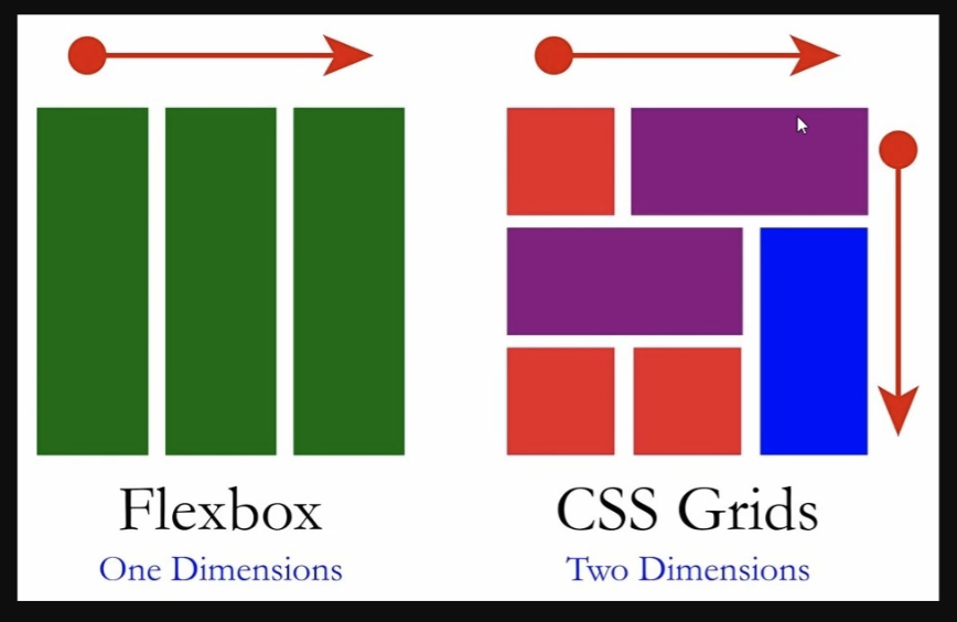
CSS flex box is made to be used to design 2d layouts, grid is used to design 3d layouts with multiple rows and columns.
It’s best to use CSS flex box within CSS grid elements to create amazing layouts.
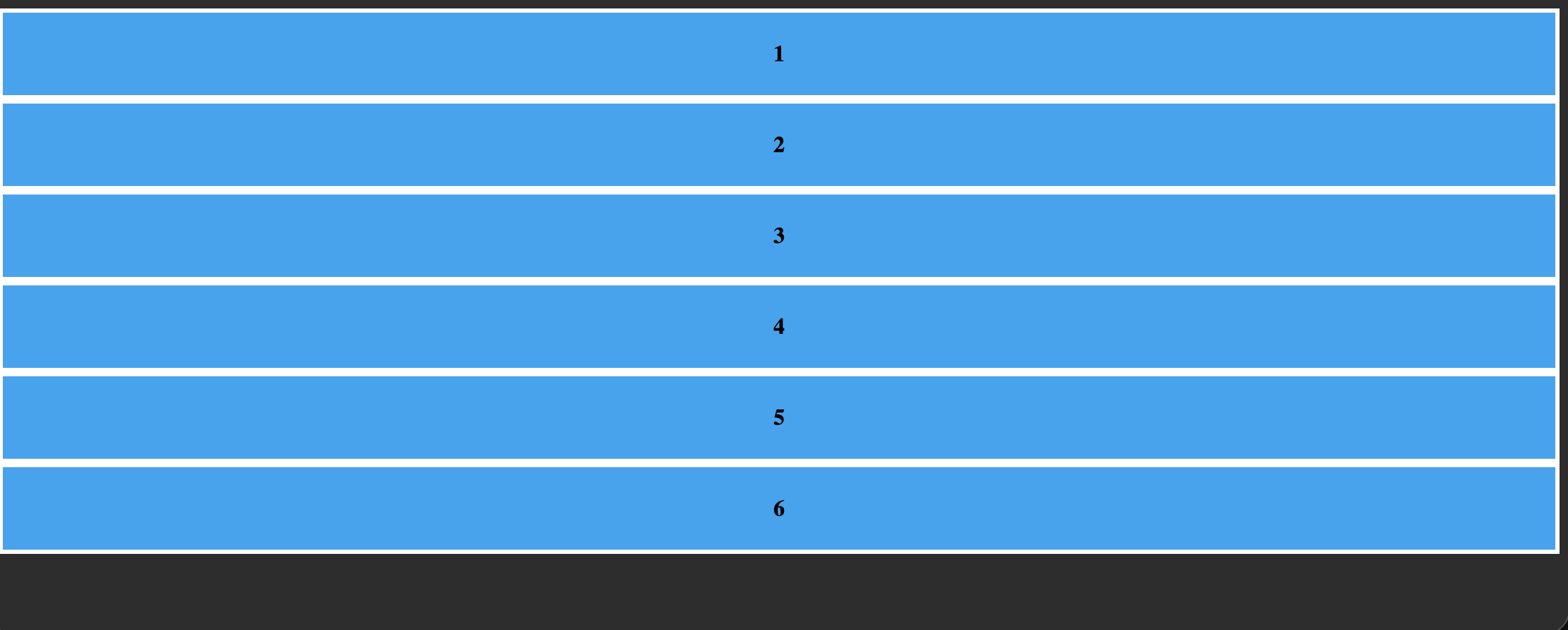
To demonstrate all the properties let’s first setup our base layout.
<head>
    <style>
        body{
            background-color: #333;
        }
        .grid-container div{
            background-color: rgb(53, 176, 243);
            border: #fff solid 3px;
            padding: 20px;
            font-weight: bold;
            /* centering text using flex */
            display: flex;
            justify-content: center;
            align-items: center;
        }
    </style>
</head>
<body>
    <div class="grid-container">
        <div>1</div>
        <div>2</div>
        <div>3</div>
        <div>4</div>
        <div>5</div>
        <div>6</div>
    </div>
</body>
grid-template-rows & grid-template-columns
Let’s apply grid and create some rows and columns.
.grid-container{
    display: grid;
    grid-template-rows: 50px 50px 150px;
    grid-template-columns: 100px auto;
}
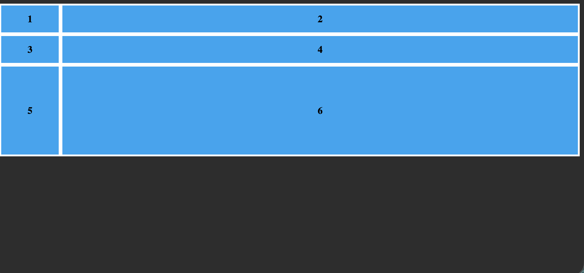
auto helps the div take as much space as it can take horizontally.
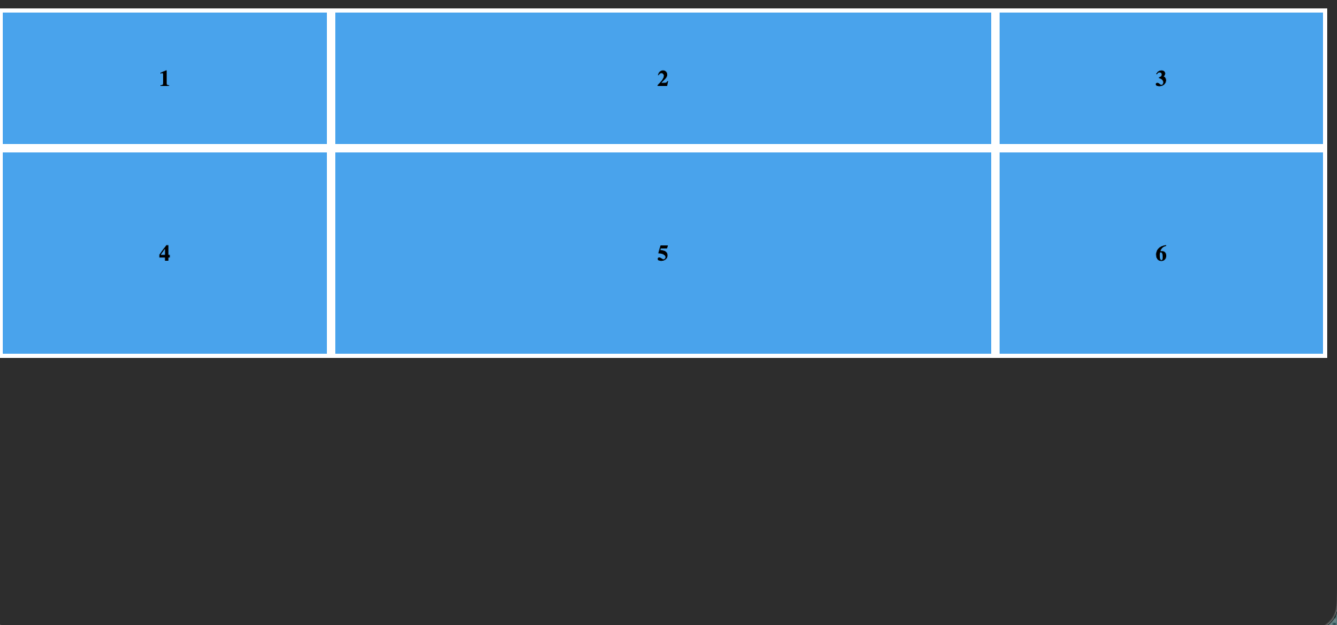
What if we wanted all to have auto but of different sizes, similar to flex-grow.
fr
.grid-container{
    display: grid;
    grid-template-columns: 1fr 2fr 1fr;
    grid-template-rows: 100px 150px;
}
repeat
If the same measurement is repeated many times we can use repeat
we can turn this
.grid-container{
    display: grid;
    grid-template-columns: 1fr 1fr 2fr;
    grid-template-rows: 50px 50px;
}
into this
.grid-container{
    display: grid;
    grid-template-columns: repeat(2,1fr) 2fr;
    grid-template-rows: repeat(2, 50px);
}
Positioning individual items
Let’s set up the base html and css.
<style>
    body{
            background-color: #333;
    }
   .grid-container div{
        background-color: rgb(53, 176, 243);
        border: #fff solid 3px;
        padding: 20px;
        font-weight: bold;
        /* centering text using flex */
        display: flex;
        justify-content: center;
        align-items: center;
     }
</style>

<body>
    <div class="grid-container">
        <div class="header">HEADER</div>
        <div class="menu">MENU</div>
        <div class="content">CONTENT</div>
        <div class="footer">FOOTER</div>
    </div>
</body>

let’s make it look like this.
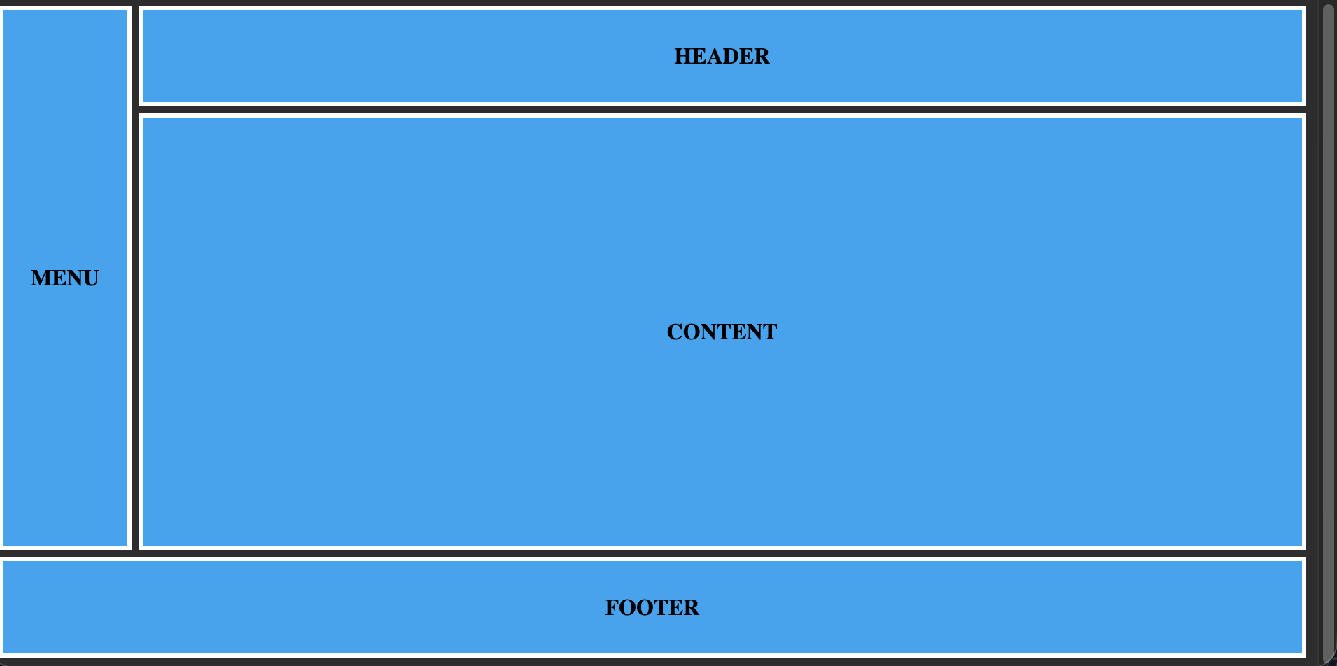
let’s start with styling the grid container
.grid-container{
    display: grid;
    grid-gap: 5px;
    grid-template-rows: 15vh 65vh 15vh;
    grid-template-columns: repeat(12, 1fr);
}
grid-gap
grid-gap is used to add space between the divs, just like gap on flex.
grid-row & grid-column
In the grid-template-columns we have used 12 repeating columns each of 1fr, even if we don’t require 12 columns it’s a good design choice incase we add more later.
.header{
    grid-row: 1/2;
    grid-column: 2/-1;
}
Header occupies column line 1 to 3 so we can also write
grid-column: 2/ 3;
we can also use span
grid-column: 2/span2
or
grid-column: auto/ span2 spans from where ever line it’s at.
or
grid-span: span
Okay let me show you all of the code, it should be self explanatory now
.grid-container{
    display: grid;
    grid-gap: 5px;
    grid-template-rows: 15vh 65vh 15vh;
    grid-template-columns: repeat(12, 1fr);
}

.header{
    grid-row: 1/2;
    grid-column: 2/span2;
}
.menu{
    grid-row: 1/3;
    grid-column: 1/2;
}
.content{
    grid-row: 2/3;
    grid-column: 2/-1;
}
.footer{
    grid-row: 3/-1;
    grid-column: 1/-1;
}
minmax
it’s a measurement when we want to the divs to have a minimum measurement of x and max measurement of y.
for example
minimax(100px, 1fr);
goes as low as 100px but as high as 1fr.
auto-fit
It’s the quantity, generally used within grid-template-column or rows.
It tells to fit as many divs as possible based on children size and parents size.
An example style
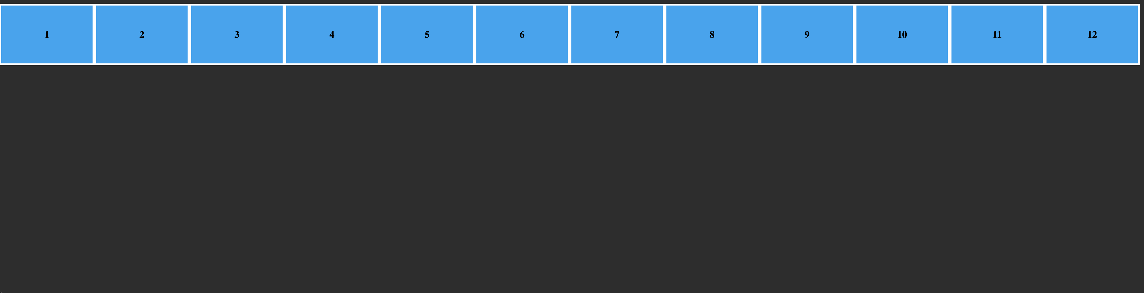
completely stretched.
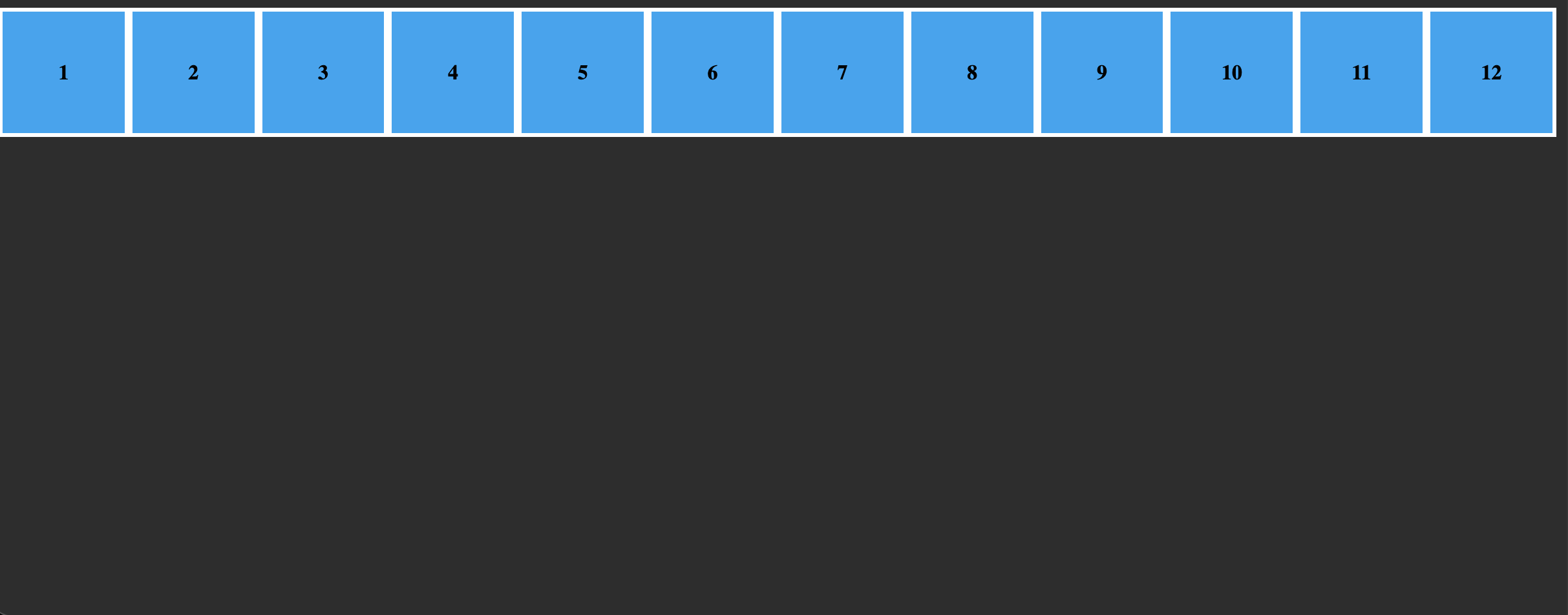
Only fitting till width 100px, but if we reduce screen more
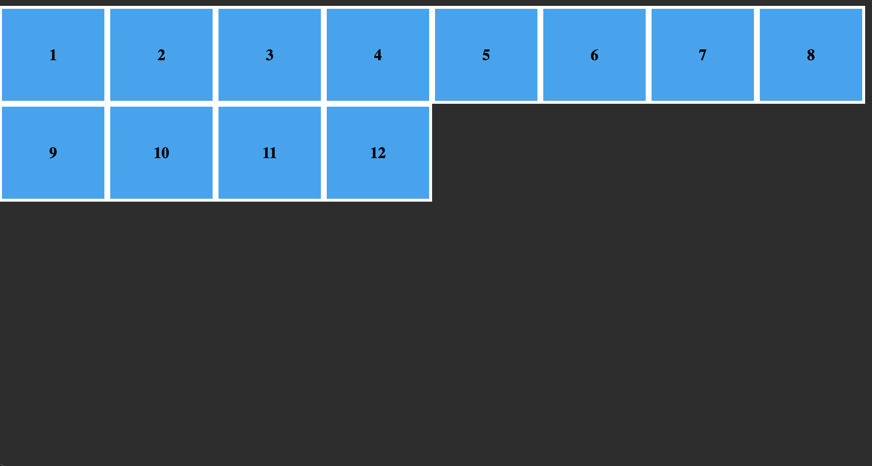
even more
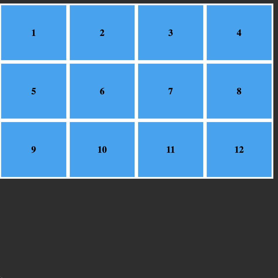
can go till even one single column.
<style>
.grid-container{
    display: grid;
    grid-template-rows: repeat(10,100px);
    grid-template-columns: repeat(auto-fit, minmax(100px, 1fr));
}
</style>
</head>
<body>
    <div class="grid-container">
        <div>1</div>
        <div>2</div>
        <div>3</div>
        <div>4</div>
        <div>5</div>
        <div>6</div>
        <div>7</div>
        <div>8</div>
        <div>9</div>
        <div>10</div>
        <div>11</div>
        <div>12</div>
    </div>
</body>
grid-auto-rows
example : grid-auto-row: 100px;
It’s super help full in case there are extra rows than initially defined by grid-template-rows, this adds a height for them all within the grid container.
grid-auto-flow: dense
used when there are elements in the layout of different sizes, it helps in keeping them fit together no matter what the screen size.
justify-content & align-content
It is used to move around the group of all the children together around the entire parent container.
values are start, end, center, space-between, space-evenly, space-around
By default both are set to stretch.
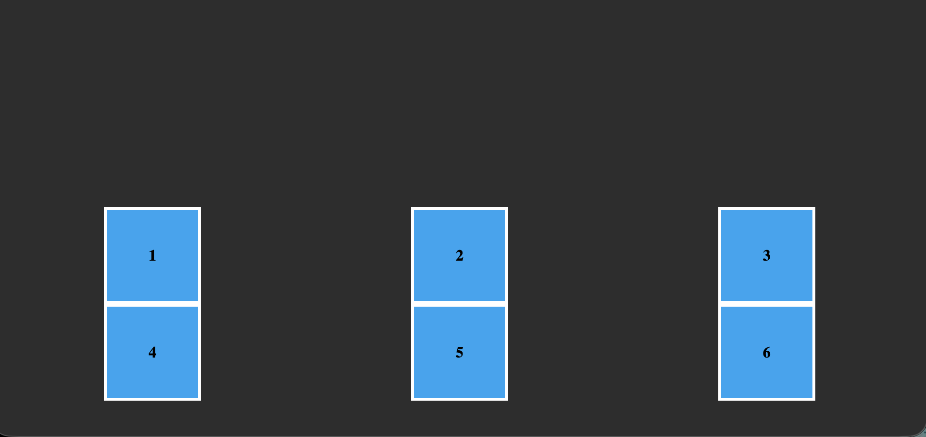
<style>
.grid-container{
    display: grid;
    grid-template-rows: repeat(2,100px);
    grid-auto-rows: 100px;
    grid-template-columns: repeat(3,100px);
    height: 90vh;
    justify-content: space-around;
    align-content: end;
}
</style>
</head>
<body>
    <div class="grid-container">
        <div>1</div>
        <div>2</div>
        <div>3</div>
        <div>4</div>
        <div>5</div>
        <div>6</div>
    </div>
</body>
Justify-items & align-items
This is used to position the individual grid items inside their respective grid cells. stretch, start, end, center, left, right , baseline
.grid-container{
    display: grid;
    grid-template-rows: repeat(2,100px);
    grid-auto-rows: 100px;
    grid-template-columns: repeat(3,100px);
    height: 90vh;
    justify-items: center;
    align-items: center;
}
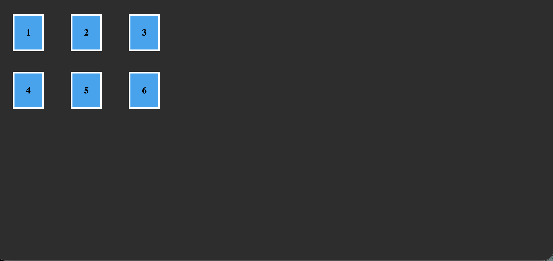
Justify-self & align-self
Like we use justify-content in the container to style all the elements, we can use justify-self to style any individual grid cell.
Didn’t cover grid template as it’s never used in production.


